
Do you know what a hair space is? I remember times in Photoshop when I wanted to make the space between two words a bit smaller, so I’d adjust the font size to something like 2px and go from there. Reading through Jeremiah Shoaf’s Flawless Typography Checklist, I now know about hair spaces and thin spaces. Mind = blown.
If you’re looking for a comprehensive but succinct rulebook for typography, this is it. Some of the guidelines were healthy reminders for me, and yet, even after years in the design world, I learned some things. Reading through the checklist, I scolded myself at times, realizing I’m guilty of violating some of these rules (I’m looking at you Rule #30 about center-aligned text). There are rules like #33 that I realized I follow almost unconsciously without realizing why. And there are rules like the ones about small-caps; I know they exist but didn’t fully appreciate the impact they make on a design until I saw the examples.
The job of a designer is to always communicate as clearly as possible.
After reading this checklist, I can more clearly articulate my opinions on typographic design. For example, as popular as it is, I’ve never really loved Helvetica outside of logo design, but I couldn’t really explain why. As it turns out, there are some very logical reasons that make it a terrible choice for body copy:
- Helvetica has too large of an x-height, so it reads poorly because the word shapes are much less distinguishable.
- The closed apertures cause some letters to start to look the same, like c and o.
- The consistency of the font is perfect for some applications such as display text or logos, but for body copy the precise, even forms create so much monotony that it becomes unreadable. There simply isn’t enough contrast for large blocks of text.
Proxima Nova is a great alternative as it retains the neutrality and strength of Helvetica with the feeling of a geometric font, yet it has distinctive elements, such as the lowercase “a”, that increase readability in large bodies of text. Yet both Helvetica and Proxima Nova are safe and heavily overused fonts. Many designers use a favorite font as a fallback option, but there is no such thing as a font that is “perfect for every occasion”, so you always want to devote at least some time on every project to font selection.
The key to using multiple typefaces is to develop a consistent type system and then relentlessly follow it—the more typefaces you introduce, the more complex your system will need to be.
Probably the most useful takeaway was the section on font pairing, particularly rules #74-78, which go into detail showing examples of type classifications that go well together. You may know that pairing a sans-serif with a serif is a good choice, but which serif is appropriate? How do you narrow it down? There is some really useful and concise information in here about why different classifications work well together, as well as tables of example fonts in each classification. If you’re looking for something to go with Futura, for example, you may want to avoid an Old Style serif, since “sleek and modern doesn’t go with classical and historical. Instead, scan the list of Modern (Rational) serifs which have similar symmetrical forms and feel constructed rather than handwritten, and you’ll find Bodoni as an excellent choice for a companion to Futura. Lato+ Merriweather is such a popular pairing, because Neo-Humanist and Contemporary Serifs share a focus on functionality and legibility.
Franklin Gothic and Baskerville are fantastic together if you want to evoke a classic newspaper feel for editorial usage, as Transitional serifs provide the appropriate body copy style and Grotesque sans-serifs, especially condensed versions, are excellent for headlines.
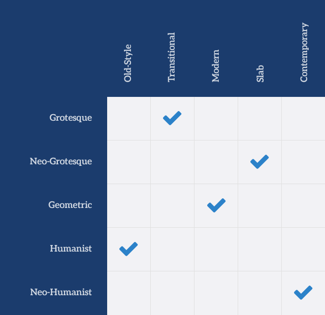
Quick guide to pairing font classifications
Good typography really comes down to the balance of details, and there are a lot of useful tips about font size proportions, hierarchy, and font treatments. One of my favorite rules is #58 which is a reminder to consider all possible font treatments and balance them. I have a penchant for italics and a tendency to over-rely on them for headers, but it’s important to remember “you may need to emphasize a word or italicize a book title, which can’t be done if everything is already italic.” I also love rules #94 and #95 about using a lead paragraph or starting paragraphs with initial small caps, as these details are not only aesthetically pleasing, but set your design apart from others. Here are some other great examples of balancing the details of your selected fonts:
- Font size proportions: Using a modular scale can help you avoid using type sizes that are too close to each other.
- Hierarchy: If you increase your font weight to adjust the hierarchy, you may not need to increase your font size as much.
- Font color: Have you ever used #000000 for text over a #ffffff background? Not only is that amount of contrast too extreme for normal situations, but using a dark or light tint of your main brand color makes your design feel more consistent. If your main color is blue, for example, you can use a very dark blue for your headline text instead of black or off-black. Thank you, rules #97 and #98!
90% of design is typography. and the other 90% is whitespace.
Designers love white space, but there’s a lot to consider in order to achieve the right balance. Far too often I see text uncomfortably close to other elements or the edge of the page, especially on mobile. Type needs room to breathe, and it’s especially important on the web, which is so busy with information that extra whitespace can feel refreshing.
Using too much space can also be a problem. When setting the space between paragraphs, for example, too little space makes it hard to distinguish between paragraphs, but too much leaves awkward gaps…rule #28 will help you here. Remembering to adjust the line height in your headlines is a crucial detail since your standard line-height of 1.5 is going to be way too much for larger headline type. You want enough space so that ascenders and descenders don’t touch or overlap, but not much more.
A lack of variety in your space can get old too. While we may be tempted to stick to the grid we’ve created, sometimes it’s ok to have text break out of it…if everything lines up perfectly to the sides, you end up with monotonous columns.
So, whether you’re just starting out as a designer or you’re a bit more seasoned, you’ll probably find the Flawless Typography Checklist to be a useful tool. Jeremiah Shoaf did an excellent job highlighting all aspects of typographic design that are important for consideration, and it’s probably the best single resource on the topic I have found so far.
Monica is a designer at Palador. When she's not pushing pixels, she's outdoors enjoying country life with her dogs Juno and Duke.